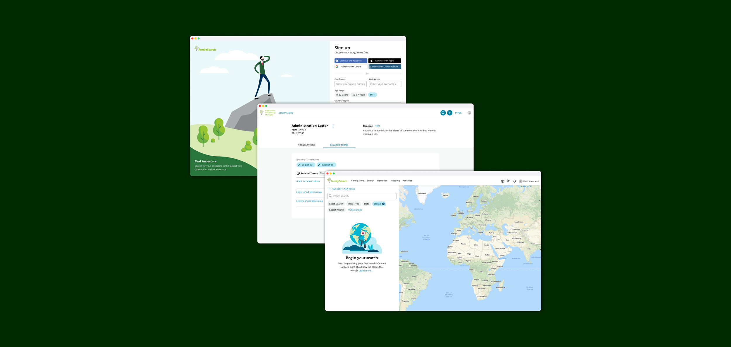
Designing a new registration flow, designing new filters for the Place’s Tool, and redesigning an internal tool.
Here are a few of the projects I worked on while I was at FamilySearch. This was an awesome learning time for me because of how established and large FamilySearch’s UX team is. Each of these projects stretched my UX skills in a different way.
MY ROLE
Designing
Usability Testing
Feedback Calls with Users
Registration
Designing for Every Scenario
The main purpose of designing the new registration workflow was to add social sign in (google, facebook, apple, etc.). Simple, right? Not really. FamilySearch is funded by The Church of Jesus Christ of Latter Day Saints and has additional church related features for members, however it still has many nonmember users as well. We also needed to require parental permission for children under the age of 12. I needed to make designs for each of these situations that felt natural and intuitive.
Adult - Nonmember
This is the simplest flow, the adult must fill the required fields (selecting an age over 12) OR use social sign in, ignore the checkbox that asks to add your membership information, and they are done.
Child - Nonmember
A child signing up for a FamilySearch account will need to first, fill the required fields (selecting age 0-8 or 8-12), ignore the member checkbox, and then get parent permission via text, email, or whatsapp. Once they receive permission they are done.
Adult - Member
The adult member must fill the required fields (selecting an age over 12) OR use social sign in, check the checkbox that asks to add your membership information, and they are done. It’s important that a member adds their information because the church related features are probably why they are creating the account, so it would be very frustrating if they missed this and couldn’t access those features.
Child - Member
A child member signing up for a FamilySearch account will need to first, fill the required fields (selecting age 0-8 or 8-12), check the member checkbox and add their membership information, and then get parent permission via text, email, or whatsapp. Once they receive permission they are done.
Registration
Prototyping for Usability Testing
Once my Product Manager and I felt the designs were ready, it was time to test them. Some of the goals of the test were to a.) validate our assumption that people would frequently choose to use the social sign in b.) see if members would add their information and nonmembers would ignore it c.) make sure people could easily complete the ‘request permission’ step d.) test our username and password recovery options.
We made sure to test different demographics to make sure we could test each scenario. The testing went very well, most importantly we found that most people said they preferred social sign in and members added their info and nonmembers ignored it.
Places Tool
New Filters that Don’t Disrupt Existing Workflows
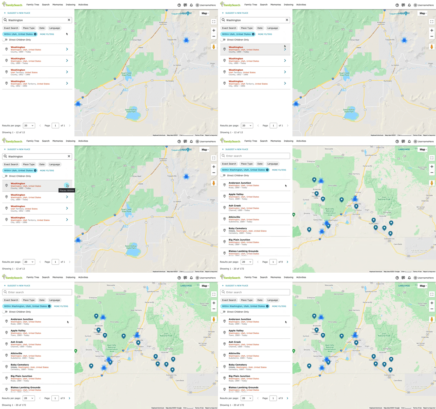
While working with the Places Team at FamilySearch I was asked to design new filters and redesign the old ones. The Places Tool* was heavily used internally, people received trainings on how to use it. The filter redesign was an effort to add functionality, but also a shift towards becoming a consumer facing tool.
My designs for the new filters used simple terminology to help new users understand. The filters themselves were small in an effort to preserve space for the search results. I changed a heavily used icon that was was hard for new users to understand into an arrow to reflect commonly used patterns across the internet.
I conducted usability tests with existing internal users and new users, the results of these tests pushed me further towards my simpler approach. The users in both groups were able to easily use the filters to accomplish their goals.
*The Places Tool provides a map of the world that users can contribute to. Most importantly, one location can have multiple names depending on the year. This is helpful for people looking at hundred year old documents to accurately assign a location.
Internal Tool
Utilizing Feedback from Internal Users
While working with an internal team at FamilySearch I was tasked with updating the UI of the Controlled Vocabulary Tool*. While updating the UI, we ran into some problematic UX that existed in the old designs. We thought it best to work with some members of the team who frequently used this tool. We had weekly meetings until the project was completed.
The meetings usually consisted of me presenting different pages of the tool that I redesigned and getting feedback if it met the needs of their most frequent tasks. This was a very large tool redesign that includes many screens, I’ve included a few of them below.
*The CV tool is a a tool used internally to properly name all the terms used in indexing. For example, this includes all the types or relationships (father, cousin, grandparent) translated into many languages.


